Information is Beautiful Awards 2018
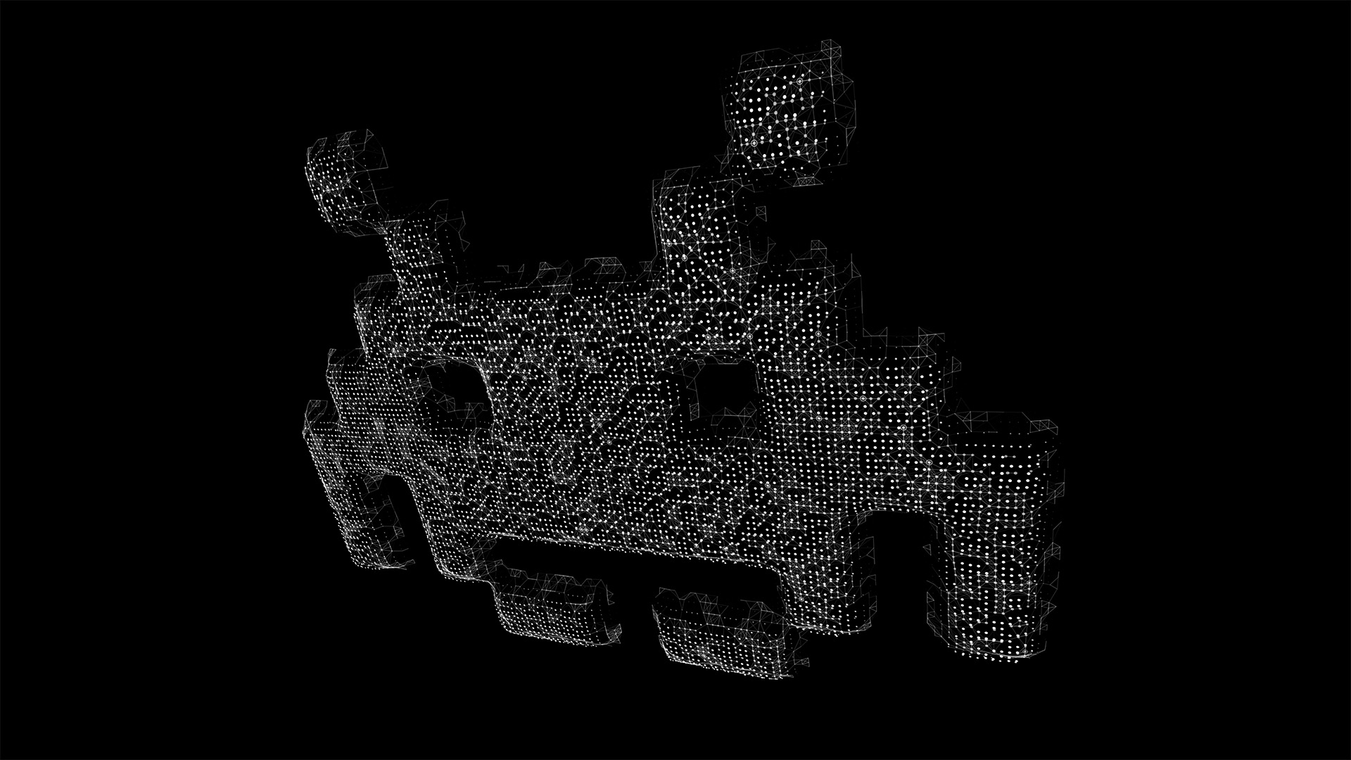
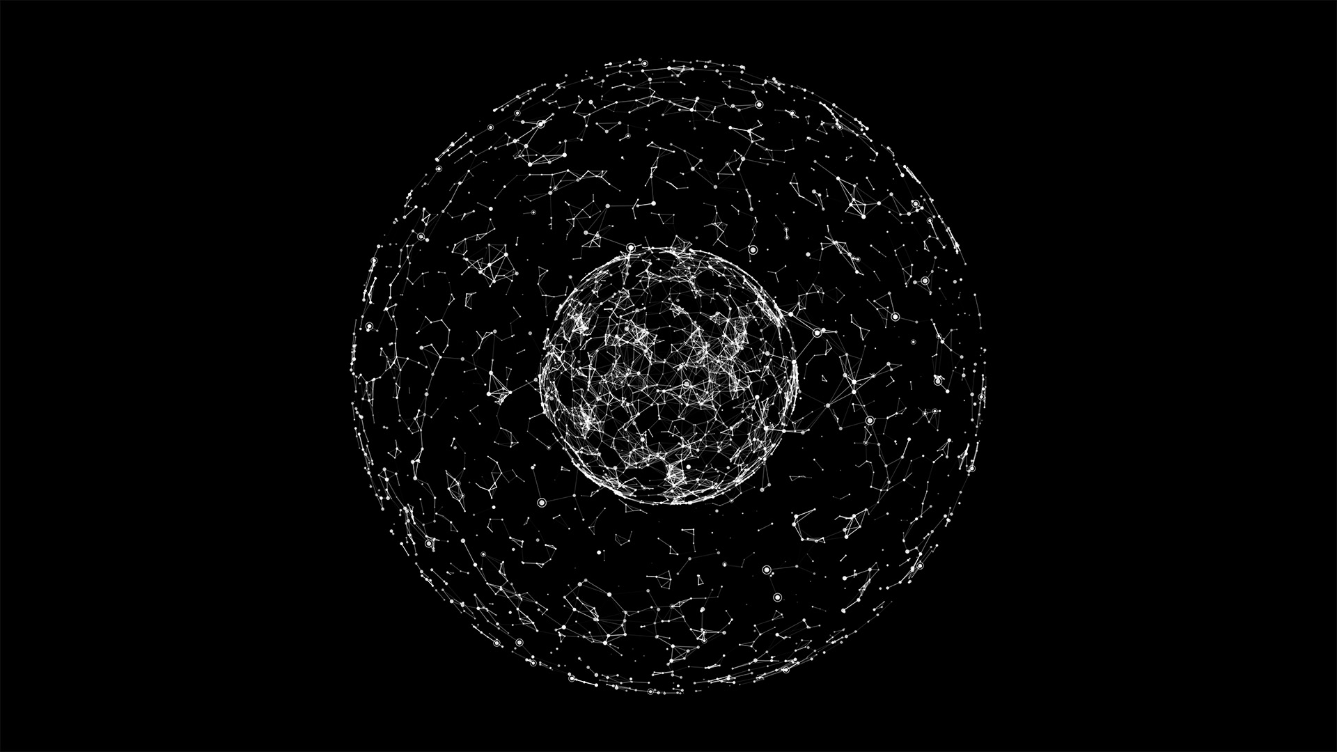
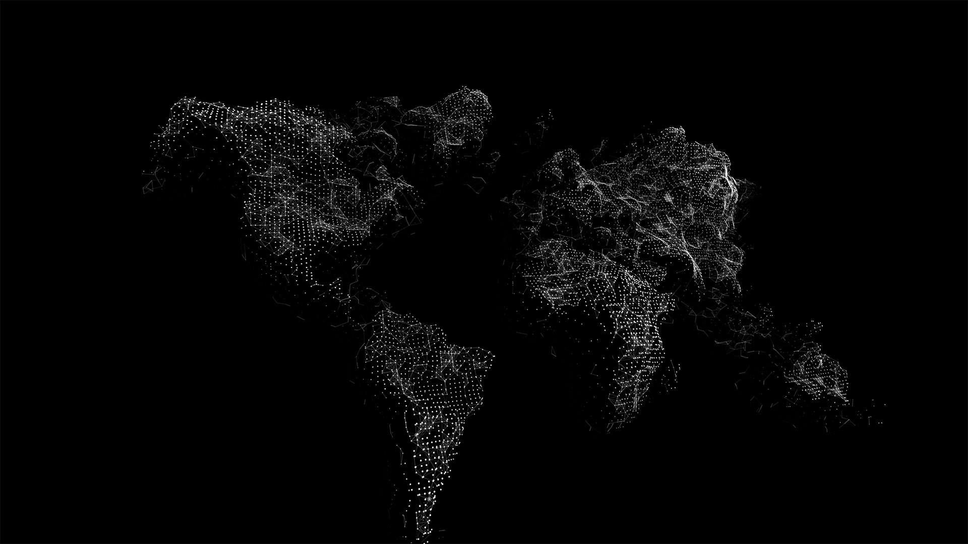
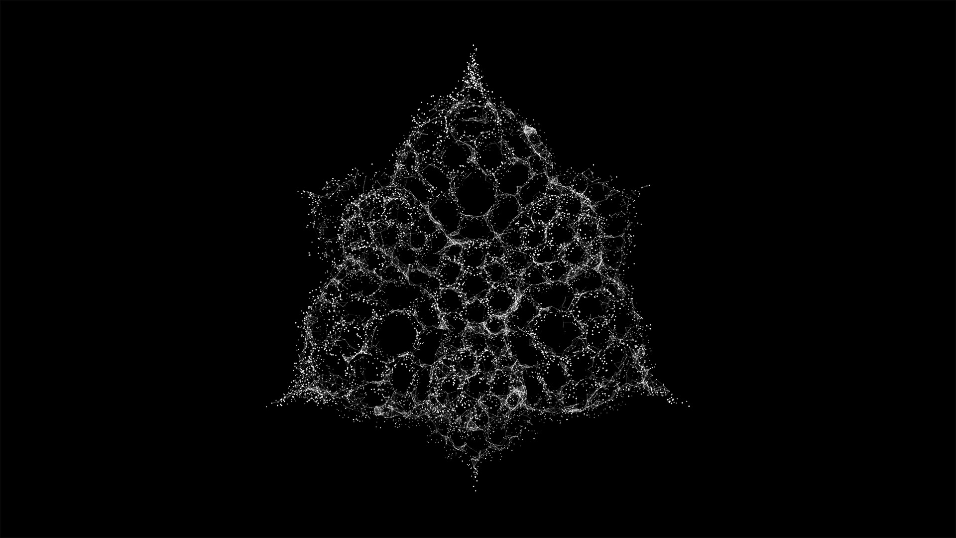
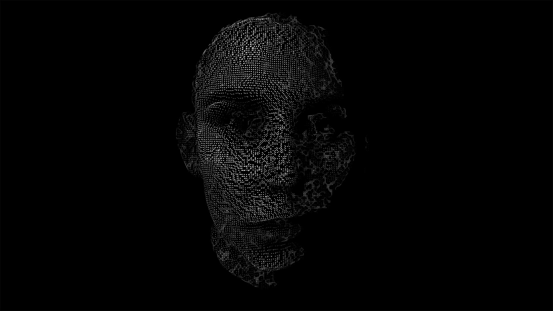
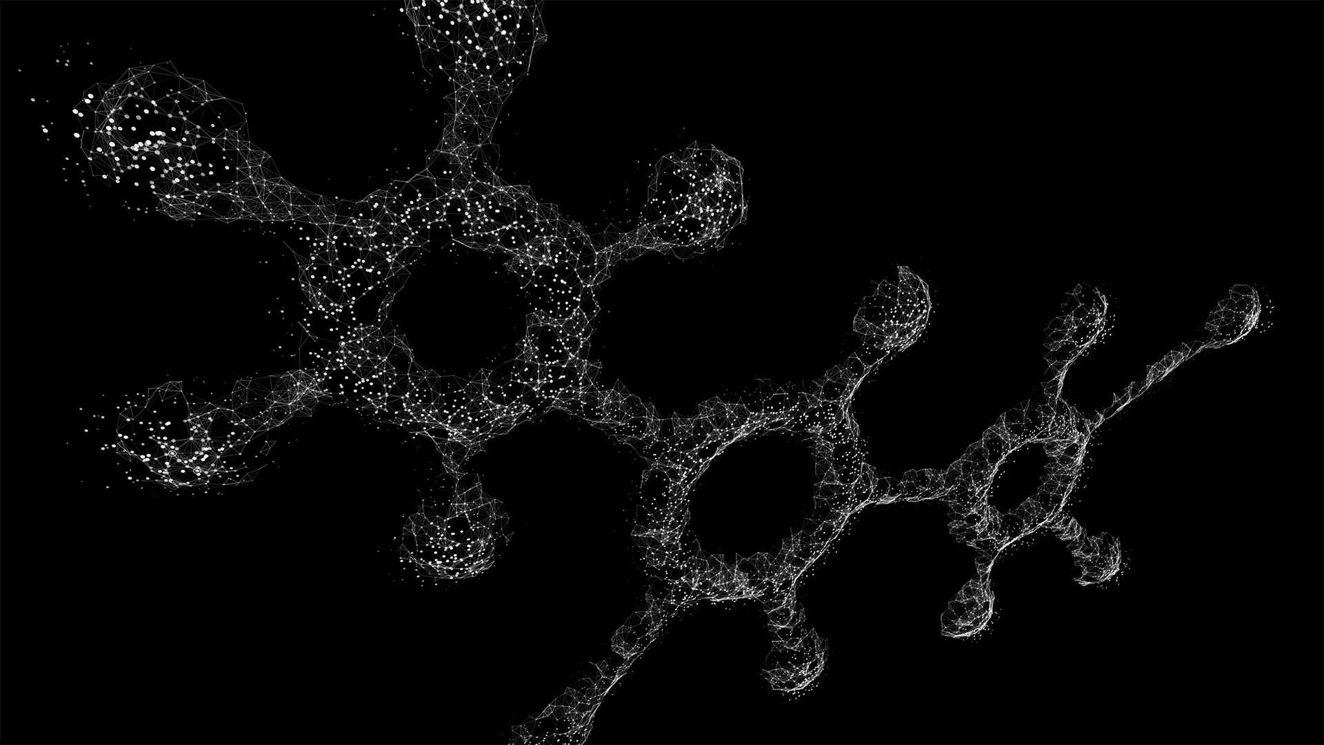
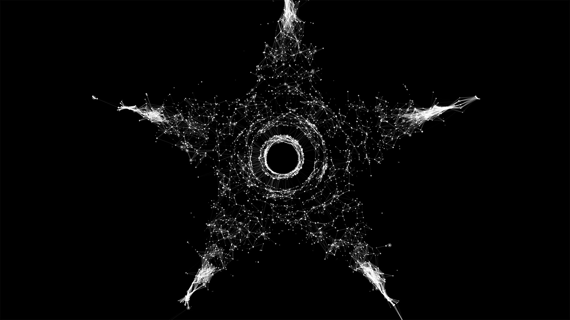
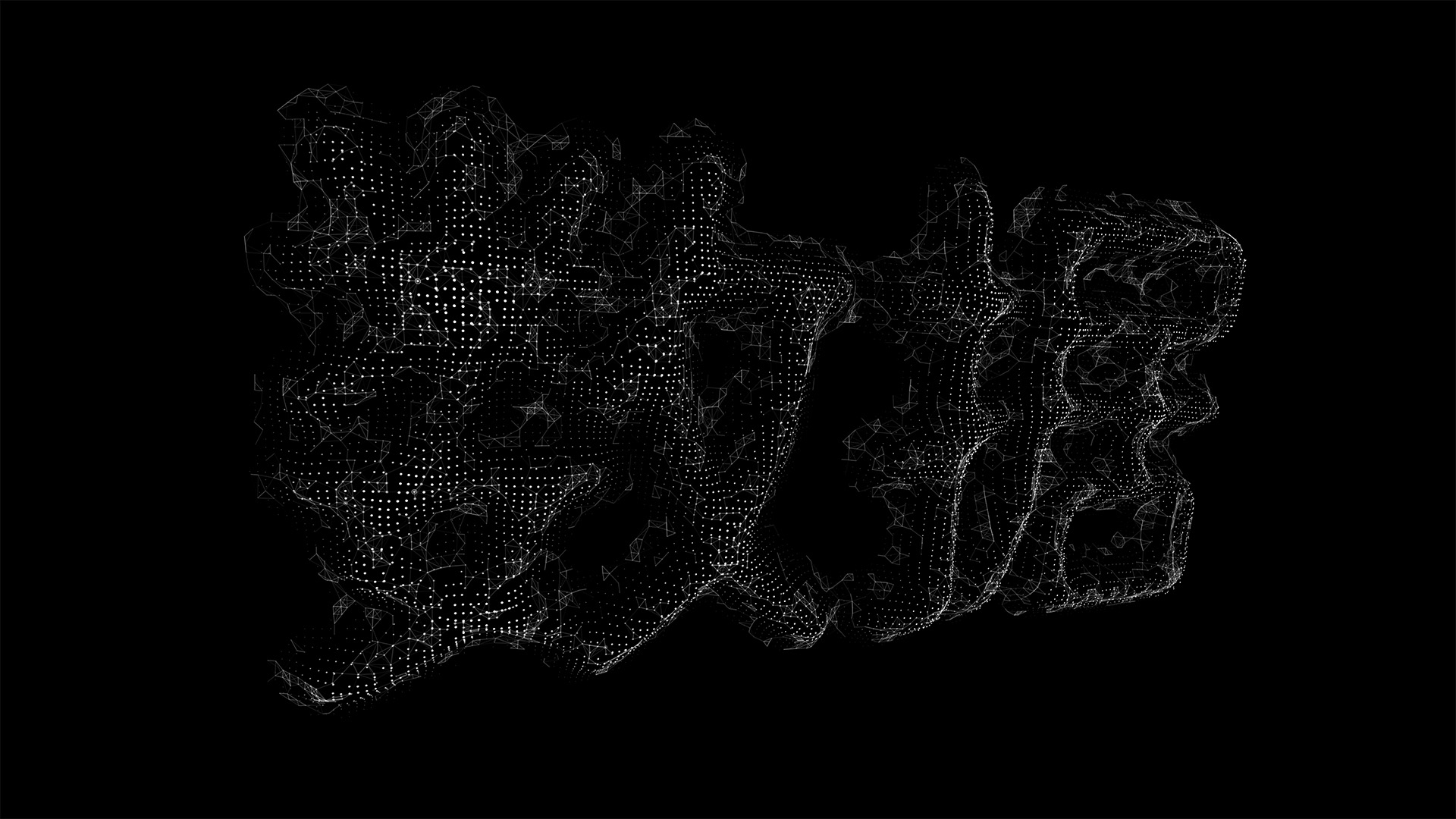
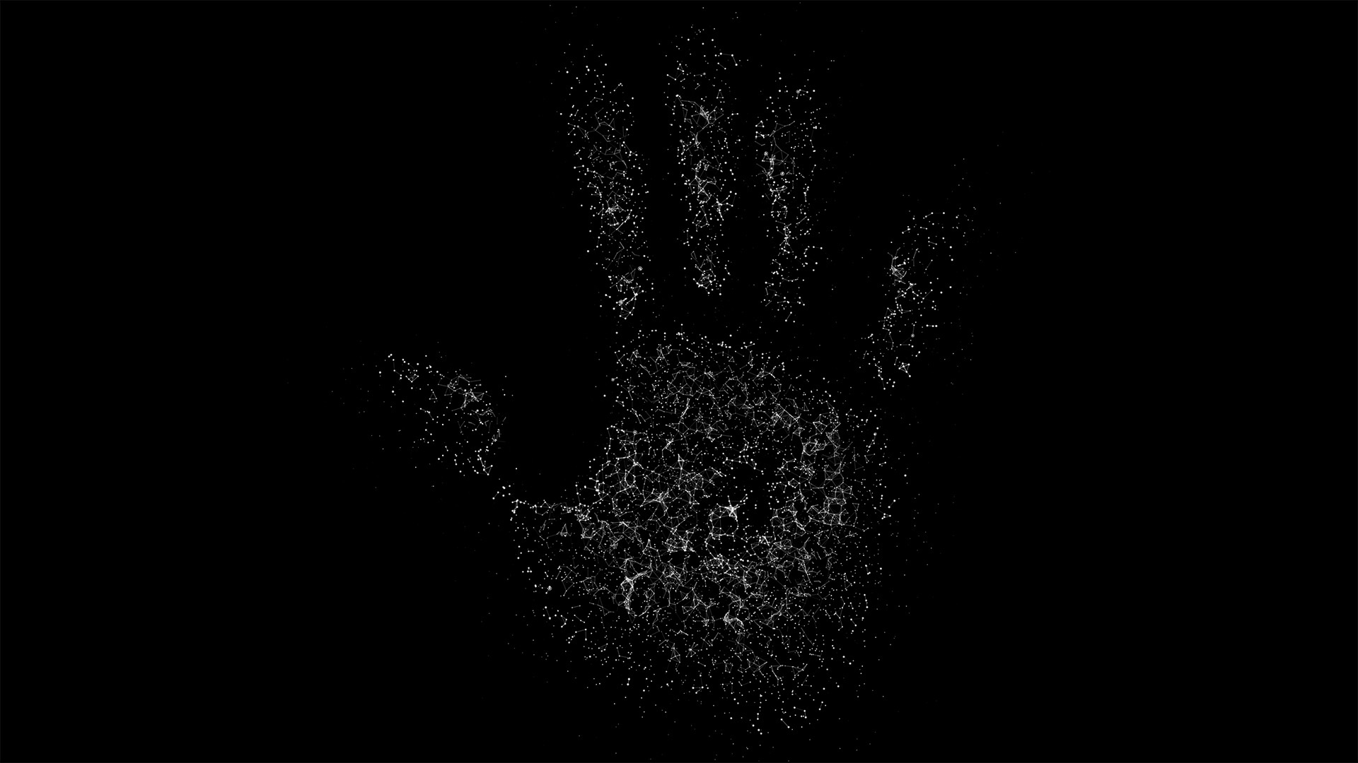
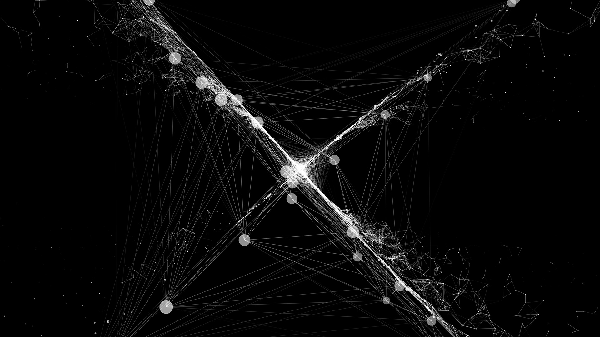
Earlier in 2018, we were lucky enough to be asked by the Information is Beautiful Awards Team to start exploring new branding ideas, with generative forms and data driven designs. Over many iterations and explorations we, created a core circular data driven logo and a series of "point cloud" style illustrations for each of the award categories.
- Client: Information is Beautiful
- Links:
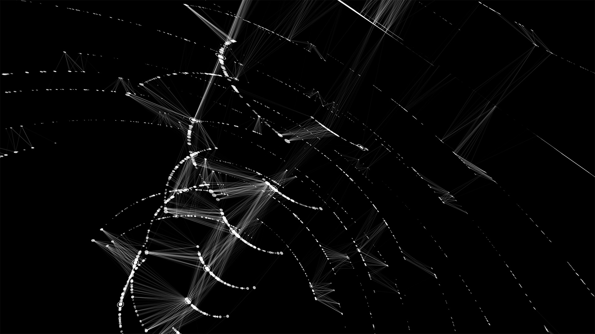
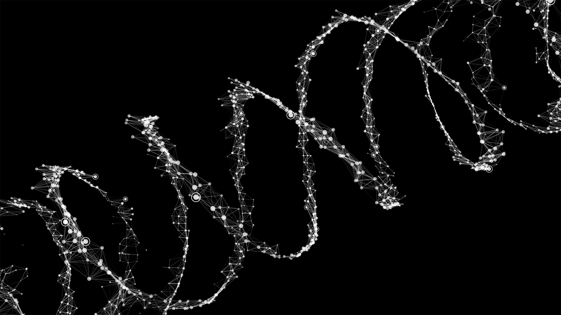
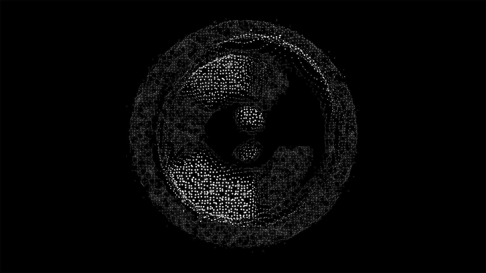
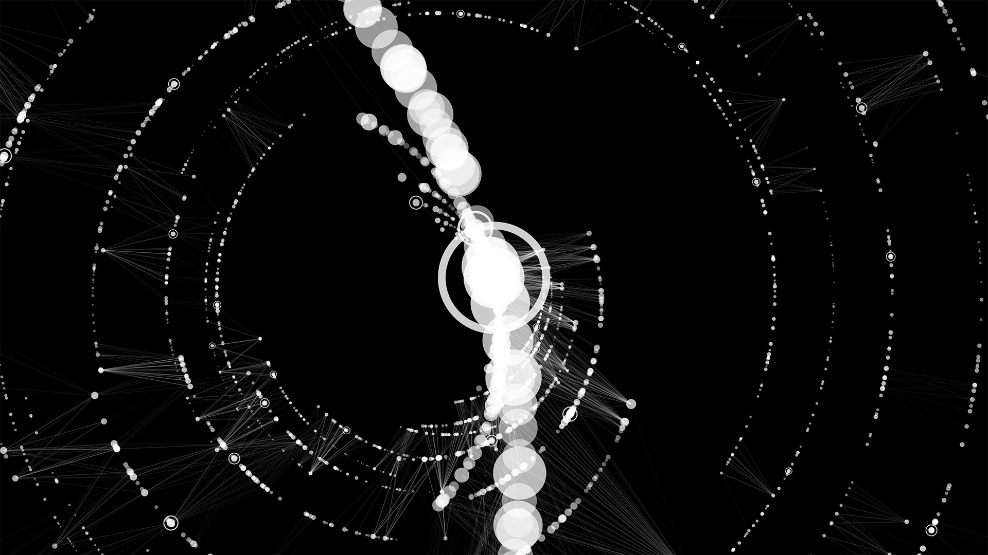
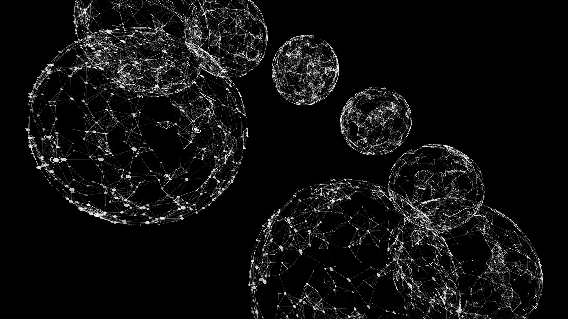
The core circular visualisation was initially based on the counts and categorisation of previous years’ awards entries. The concept with the 3D data structure is as follows; each Z layer is a year, each radius step out from the centre is a category group, each point is an entry (scaled by votes) and each ringed point is the winning entry in that category.
We created an initial visualisation using the previous years' entry data, but it wasn’t quite as dense or balanced as we’d hoped it might be for the design, and so in the end we used a looser system to generate more random counts of entries and categories within ranges to give a more balanced & dense output.
The connections between points (entries) represent the cross pollination of ideas & relationships within this tightly knit community. Entries with a greater number of votes have a greater range of connection, so a greater influence in the community.
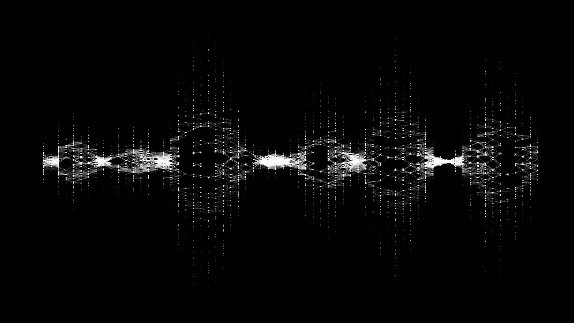
Finally, we created a system to transform between the points within the circular visualisation and the point cloud compositions.
See the video & images below of some of our favourite moments!